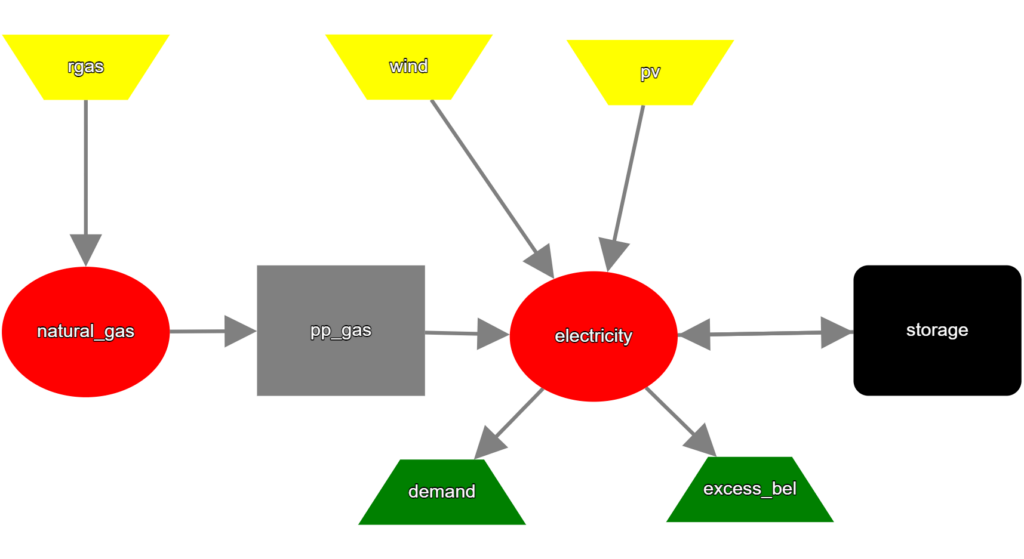
Modelling energy systems as graphs, as we do it for oemof, is a rather clear approach. It can help understanding energy flows and the overall network structure. However, in highly complex systems keeping of all the components track becomes increasingly difficult. To tackle this, Tobias Hörter and Andreas Wunsch from Fraunhofer IOSB have created an interactive plotting tool.

The example can be found as a Snippet at the Faunhofer GitLab. The code enables visualization of the system and representation of the component’s parameters upon the model-creation. They use a combination of NetworkX and Plotly DASH Cytoscape for this purpose. The parameters of the model components are first extracted and a NetworkX model is created from the solph energy system afterwards. This network is then used to make cytoscape elements, which are necessary to enable DASH-Plotly to visualize the network.
When running the Dash-App, the user can rearrange the system via drag and drop. Additionally, when clicking on the system components, the parameters of the respective component are displayed. Do you like this approach? How do you draw the energy system graph if you need it?

There is a long article about this at Medium: https://medium.com/@tobiashoerter/creating-a-solph-graph-for-energy-system-visualization-in-python-db7187c5f3bb
Remote Reply
Original Comment URL
Your Profile